
Responses by Stephanie McArdle, head of design, Droga5 London.
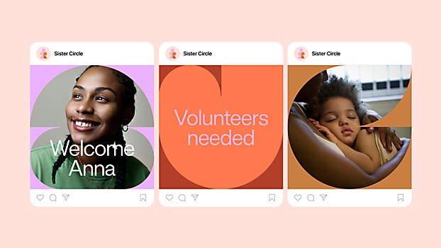
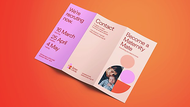
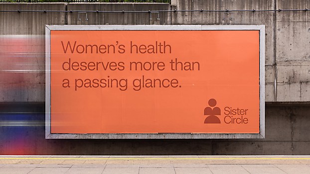
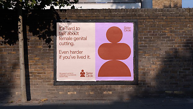
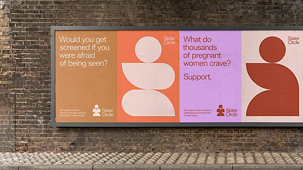
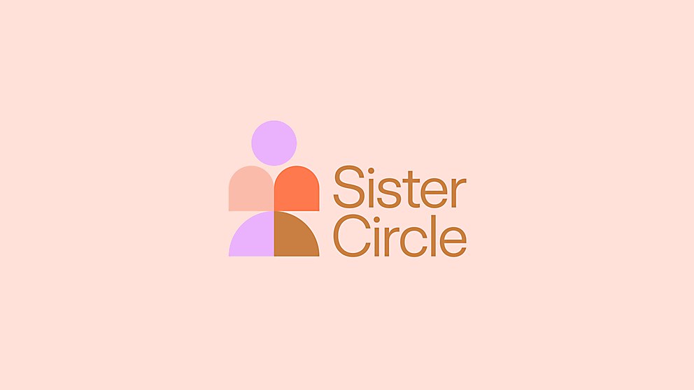
Background: We rebranded a women’s health charity that has been going since 1981 in East London as Sister Circle, and we gave it a new identity, an updated toolkit that better reflected who it had become and would help it grow to support more women across an increasing area of London. We launched the rebrand with an outdoor and social campaign to boost awareness and drive donations.
The charity supports women in challenging circumstances, such as those facing poverty and language barriers, to empower themselves and lead healthy lives. These women were the target audience, followed by the volunteers, staff and donors who comprise the Sister Circle community.
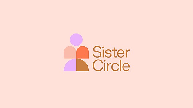
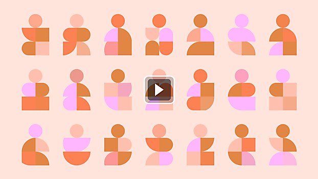
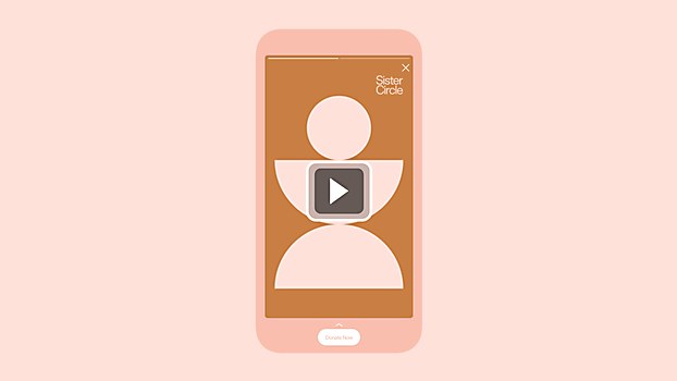
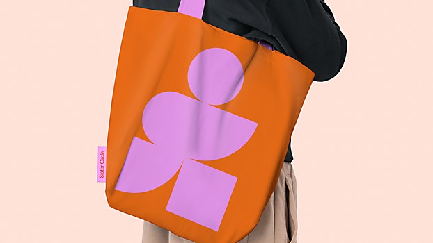
Design thinking: Community is an important word when describing Sister Circle; it’s not only who it is but also what it offers—it is a support network. So, the visual identity represents the diverse women who make up this community. Conceived by our senior designer, Hannah Stewart, the identity consists of geometric “sisters” derived from circles. It celebrates strength in numbers and the power of coming together.
Challenges: The challenge of dealing with such sensitive subject matter became especially apparent when creating the brand’s tone of voice. We wanted to use language that highlighted the adversity these women face in a way that would make people take notice, but we did not want to do this in a way that would disempower those women, so getting that balance right was tough. Our writers solved it with a direct, hard-hitting tone while being sensitive at the same time. There is a simplicity to it that is an essential trait of the brand.
Favorite details: Our solution reflected who Sister Circle is so perfectly. At its launch event, listening to the stories told by various women that the charity touched really moved me. We had done it justice. All our work for Sister Circle precisely fitted its purpose. I think this happened because agency and client listened to each other. We didn’t start the project with any preconceived ideas of what it should be, and neither did Sister Circle.
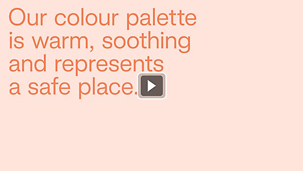
Visual influences: Our research of other charities working in this space, the National Health Service and other health-related organizations revealed a market overloaded with information, impossible to navigate and lacking in warmth. Women needed a safe, inclusive space, so this influenced the brand’s tone, resulting in a warm, soothing color palette and typography with a tone of voice that is simple and easily understood.
Time constraints: We had no budget, which also translates to no time. So, aside from pulling favors, we had a very DIY approach to the design. It resulted in a very simple design system, which, in turn, was beneficial for the client as it would be easy to roll out over time, keeping costs down.
Browse Projects