


Responses by Dainin Solis Collado.
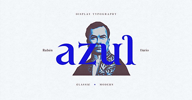
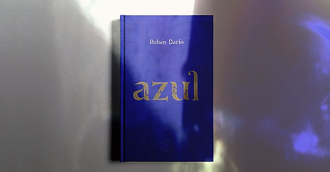
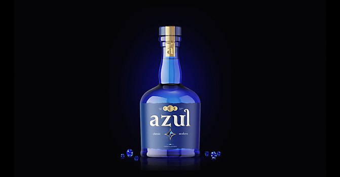
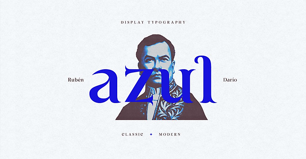
Background: Azul Display is a typographic proposal inspired by Rubén Darío, the Nicaraguan poet who led the modernismo literary movement. Specifically, Azul Display is a concept aesthetically influenced by the ornamental details present in the uniform worn by Darío in front of the court of Alfonso XIII, King of Spain, in Madrid in 1908.
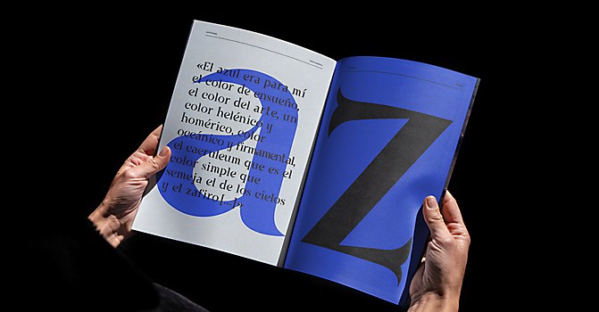
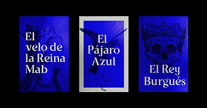
Based on a Roman structure with subtle alterations, the typeface is called Azul after Darío’s collection of short stories and poetry Azul…. The contrast between its lines, terminations and curves gives it a stately, classic appearance.
Design thinking: Since childhood, every Nica grows up learning and admiring the life and work of Darío, his prose and verses. Azul Display is my most humble tribute to this truly important figure in the history and culture of Nicaragua.
Challenges: This was my first time designing a typeface at this level—and in such a short time. It was a fast-paced, frenetic process, but ultimately it was fun and rewarding to see the result.
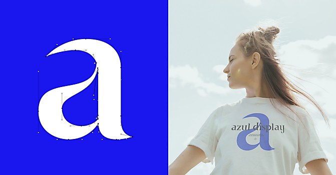
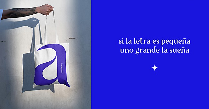
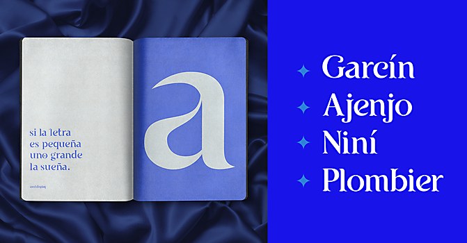
Favorite details: Of all the letterforms, my favorite is the lowercase a. I love its simplicity and its overall final shape.
New lessons: I learned to observe letterforms and grew amazed at how the smallest detail could have a huge impact on the final shape of a letter. A stressed vector handler, a poorly executed curve or an anchor point where it doesn’t belong, and the letter you’re building is perceived differently.
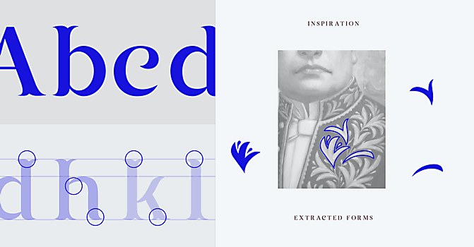
Visual influences: During the research and reference stages, I found, in the embroidery of Darío’s iconic ambassador suit, visually interesting ornaments that became the basis of elements for the construction of the letters’ shapes through a process of abstraction. The final result is a typeface with a classic base and a contemporary feel.
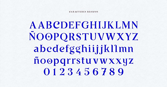
Time constraints: Azul Display was born as a result of “Typographic Design for Dummies,” an intensive workshop by designer and typographer Edwin Moreira. He challenged us to develop a typographic display project with a minimum of 36 glyphs in only six two-hour classes over five weeks. At the end of the workshop, I completed all the lowercase letters and a couple of key visuals for the type specimen, enough to see Azul Display in action. I was so enthusiastic with the result I obtained in a relatively short time that I decided to continue refining the project until I completed the rest of the characters: uppercase, numbers and some punctuation marks. I also designed complementary visuals and animations to enrich the graphic universe of Azul, building a robust case study for my portfolio.
Divergent paths: If I could start the project over, I would definitely educate myself more on the basics of type design. And I would work even longer on refining the base strokes and proportions of the letters until I got them right before developing all the other letters. I had to redo many of the letters a couple of times—a rookie move, you know, but you learn a lot from your mistakes.
Browse Projects