Loading ...

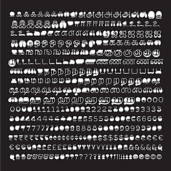
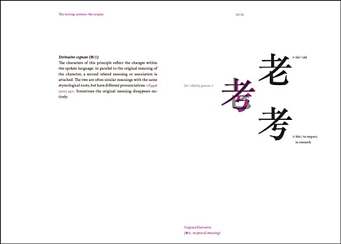
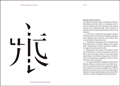
The past in color: I visited the University of Chicago’s library with a guest pass a few years ago, and the world language stacks were filled with incredible examples of South Asian lettering from the 1950s to the 1990s. There were thousands of well-preserved, colorful book jackets that acted as time capsules for an experimental, exuberant era before digital typography made everything bland.

Focus playlist: You’ll find me listening to 20-minute-long Qawwali songs by Nusrat Fateh Ali Khan, lo-fi hip-hop by ChilledCow, or the same three songs on repeat for four hours.

Reassessment: In 2020, following the Black Lives Matter protests, there was an article from Alphabettes.org that called for designers to question their practice and ensure they are actively allowing space and opportunities for others. I’ve since reassessed my role in the Indic type scene and joined the TypeWknd team, which hopes to push toward a more inclusive type industry.

Mind-blowing work: Anagha Narayanan’s Ilai, a Tamil script typeface that makes use of variable font technology, morphing from ultra-distorted top- or bottom-heavy extremes with a delicate, organic middle stage. When animated, it looks like a lava lamp!

Helpful resources: TheType is probably the go-to resource about typography in the Chinese cyberspace; though it’s been online for more than ten years, many designers in China still don’t know about it. I also find shuge.org, a digital library hosting an array of scanned classical canons, and kongfz.com, China’s online secondhand books trading center, to be helpful when I carry on my research deep into the visual past of Chinese typography.

Essential editor: Glyphs is the most useful and ambitious font editor out there. We are using it to make Chinese font creation easier. It is an essential tool and could even become the standard for basic graphic design in the future.

Dream collaborator: I would love to work with architect Rem Koolhaas. Compared to architects who are autonomous and self-assertive, Koolhaas cares more about social research and engagement. His work is more responsive to functionalism in this era of information. I also like the way Koolhaas organizes information, as architecture, similar to typography, is an act of knitting and weaving information into different spaces.

Career booster: Design conferences. They appear to be just a learning experience, but they are also a great place for networking. Typography is a niche, and not many people request fonts, so relationships are helpful in order to gain new clients.

Inspirational book: I’m currently reading Atomic Habits: An Easy & Proven Way to Build Good Habits & Break Bad Ones by James Clear. It can inspire you to become a better version of yourself, to do little things that can eventually change your way of living.

Digging deeper: At first, I only saw typography in an aesthetic way. But when I learned about the amount of work, attention to detail, functionality and coding that was necessary to make these font creations possible, I was blown away, and I completely fell in love with the process.

New voices: Now more than ever, there are many emerging type and lettering talents, like Rebeca Anaya, Sirin Gunkloy, Cris R Hernández, Beatriz Lozano, Karla Pasten (Mixtli), Jassiel Rivera and Keya Vadgama, just to name a few.

End-of-day reward: Watching YouTube videos and eating dessert.

Splurge-worthy investment: With both my wife, who’s a book designer, and me working remotely, and the kids doing remote learning, it was hard for any of us to find a quiet place to work. So, I created a micro recording studio in our apartment where any of us can go to have a meeting, record audio and video, do some concentrated reading or writing, or just get some solitude.

Enlightening reads: Hanzi Graphy: A Typographic Translation Between Latin Letters and Chinese Characters by Mariko Takagi was eye-opening. Letters from a Stoic by Seneca the Younger and Meditations by Marcus Aurelius have helped me process the insanity of 2020.

Entertainment: The Netflix show The Last Kingdom and comedy podcast Uhh Yeah Dude are both longtime guilty pleasures. Groundbreaking design: I love what Superunion and Fontsmith did for Amsteldok. It’s a fantastic spade-in-the-ground demonstration of the dimensional-design-space possibilities of variable fonts.

Wishful thinking: I’d love to design stamps for the United States Postal Service because of Bradbury Thompson’s work for them—and while I’m mentioning impossibilities, I’d love to have worked with Thompson, Muriel Cooper and Cipe Pineles.

Valuable resources: Online archives like the Letterform Archive, along with Alphabettes.org, because they are all about sharing knowledge. I also go on Twitter and specific online forums such as TypeDrawers. And I really like the Association Typographique Internationale conference and the Type@Cooper program.

Delightful typeface: Viktoriya Grabowska’s Birra Saison because of its playfulness and imagination.

Eye-opening work: Scripts that are not based on the Latin alphabet, like Arabic typefaces. In particular, I like those that are designed by type designer and lettering artist Kristyan Sarkis.

Simple pleasures: Ice cream from the gelato shop DelaCrem and swimming in the sea.

Dream collaborator: Graphic designer Milton Glaser because of his philosophy of life and the way he applied it to his work.

Workday fuel: Fortunately, I’m not addicted to caffeine. A 30-minute walk is much more effective for me.

X

With a free Commarts account, you can enjoy 50% more free content
Create an Account
Get a subscription and have unlimited access
Subscribe
Already a subscriber or have a Commarts account?
Sign In
X

Get a subscription and have unlimited access
Subscribe
Already a subscriber?
Sign In