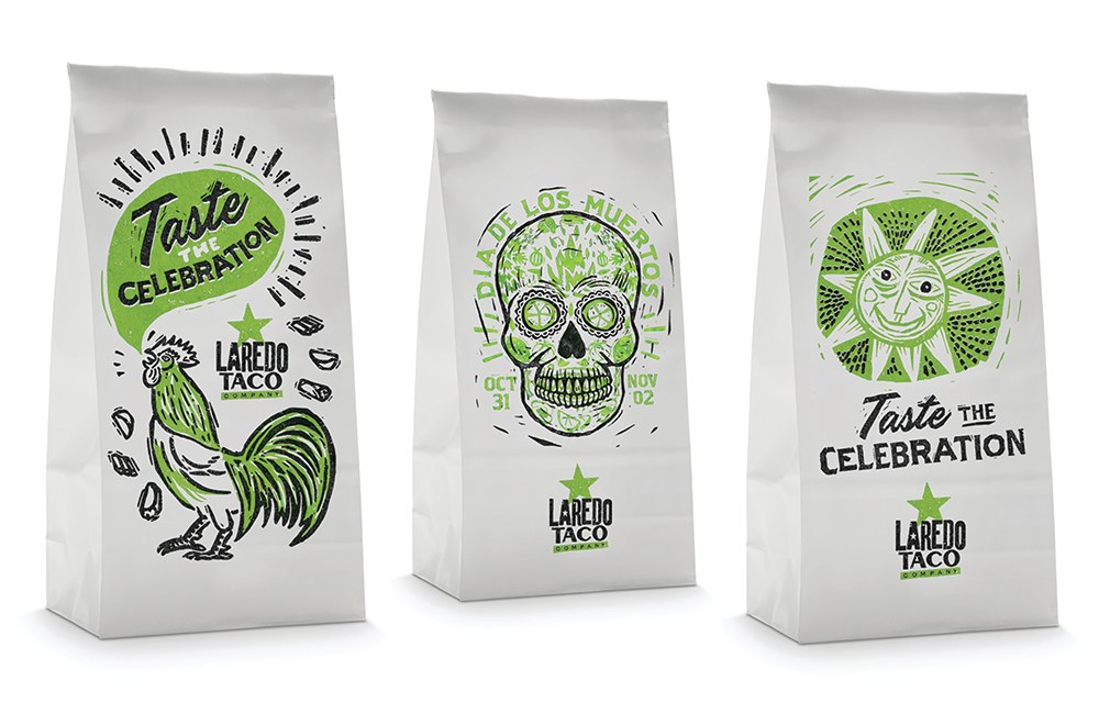
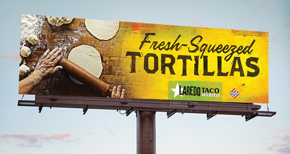
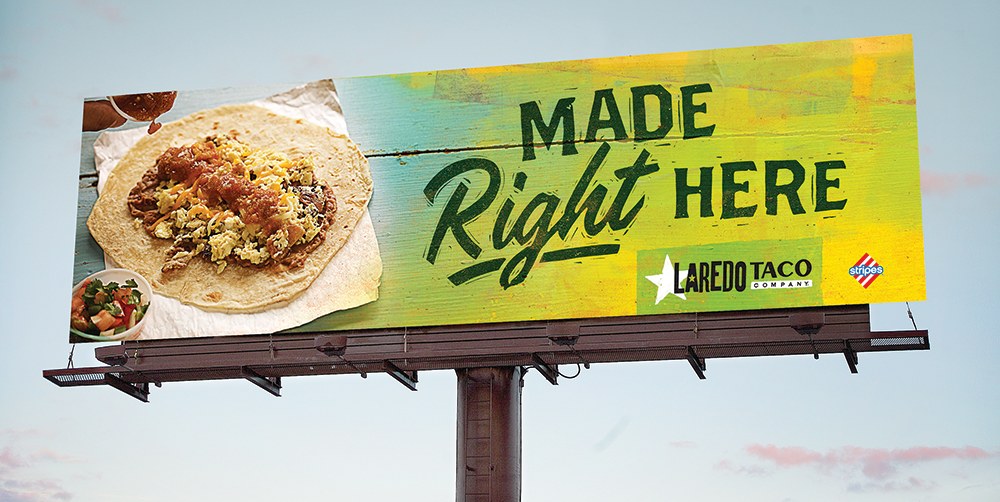
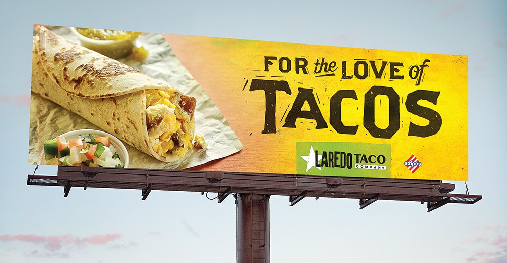
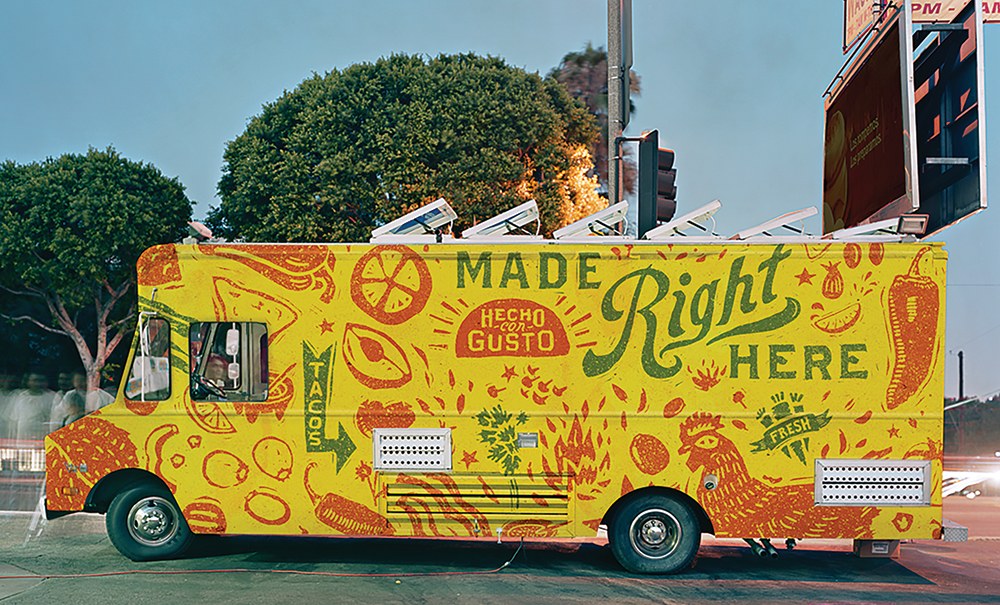
You wouldn’t expect to find hand-rolled tortillas and freshly chopped pico de gallo in a gas station, but that’s exactly what you get at Laredo Taco Company. The problem? Its brand didn’t convey that level of authenticity at all. We addressed this by redesigning the logo using linocuts, giving it a more handmade feel. We applied the same design direction to the typography and illustrations to tell authentic stories in a fun, relaxed way. We followed suit with our style for food photography, only using natural light for shoots. By the end of the process, Laredo Taco Company had a brand identity that was just as flavorful as its tacos.