Responses by Matt Shapiro, creative director, The Republik.
Background: After twenty years, the Market Common Clarendon in Arlington, Virginia, rebranded to “The Crossing Clarendon.” Real estate investment trust Regency Centers Corporation turned to us to work within the newly developed identity system to create transition messaging and promote merchants across the center. Residents represent a wide range of ages and backgrounds: they may be people in their early twenties attracted to the Clarendon neighborhood’s music scene; condo-living young professionals who work on the Hill or in private-sector jobs; families in townhouses; or older couples who have lived int he area since long before the real estate boom sent prices climbing. Because of Clarendon’s relatively high housing prices, residents tend to be on the more affluent end of the spectrum. We created a brand refresh for the upscale property, which included a series of banners and store window posters, as well as digital ads and videos that demonstrated that the Crossing intersects with the things you love.
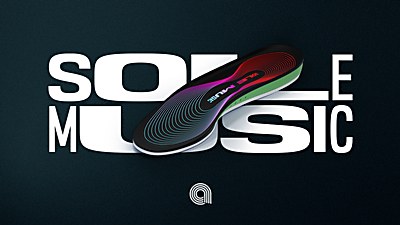
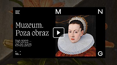
Design thinking: We created visual collages that were straightforward, effective and drew attention to communicate the unique offerings of merchants around the refreshed Crossing—a striking, memorable way to make the message of the rebrand clear. The Crossing is a place where everything you need collides.
Challenges: Once we found the solution, the most challenging aspect of the project became one of the most enjoyable aspects as well: finding a unique way to combine vendors that had virtually nothing in common. Once a few were discovered and rough comps were made, the concepts started to flow.
New lessons: Creating visual connections between two dissimilar objects became an obsession of the team since its development. It was quite challenging at first, but the more time we spent on it, the more we start to see it everywhere. It became a game our minds played in the background.
Visual influences: The work of George Lois was influential in this campaign’s creation. His seemingly simple and clean solutions for visual communication were the teams’ north star. The artwork of John Stezaker and Moon Patrol also influenced the campaign.
Specific project demands: The most challenging request was the use of key vendors for each mashup. It wasn’t always easy to find a combination that worked in a way that showcased both equally.


